

Walk down any street in Abu Dhabi and you’ll see a mix of color, light, & design competing for attention. Cafés, boutiques, offices — everyone’s trying to catch your eye. But once in a while, one sign pulls you in without trying too hard.
You look up, and it’s not the biggest or the brightest. It’s just done right. The letters rise off the wall, the lighting feels balanced, and for a moment, it looks alive. That is what 3d signage Abu Dhabi does when it’s designed with care — it turns a name into something you can feel.
A good 3D sign is not just an accessory for your storefront. It’s your first impression, your silent introduction, & sometimes, your best salesperson.
Why 3D Signage Works So Well
Flat signs have their place, but they often fade into the background. 3D signage, on the other hand, naturally draws the eye. Our brains are wired to notice light and shadow — that depth makes things look real & tangible.
When you walk by a sign that catches light at different angles, it gives the space personality. It says, “We care about how we show up.”
That’s the real charm of 3D signage — it’s not loud or flashy, it is confident. It does not beg for attention; it earns it.
Color: The Emotion Behind Every Sign
Colour is the emotional language of design. The right colors can attract attention, build recognition, & even influence how people feel when they see your brand.
Bright colors like red or yellow grab attention fast — great for lively, energetic businesses. Muted tones, black, white, or metallics create an elegant, professional vibe.
But here’s the real trick: contrast.
You want your letters & background to have enough difference that your sign stands out from far away. Nothing ruins a design faster than colors that blend into each other.
And of course, stay true to your brand palette. People recognize you by colour before they even read the words.
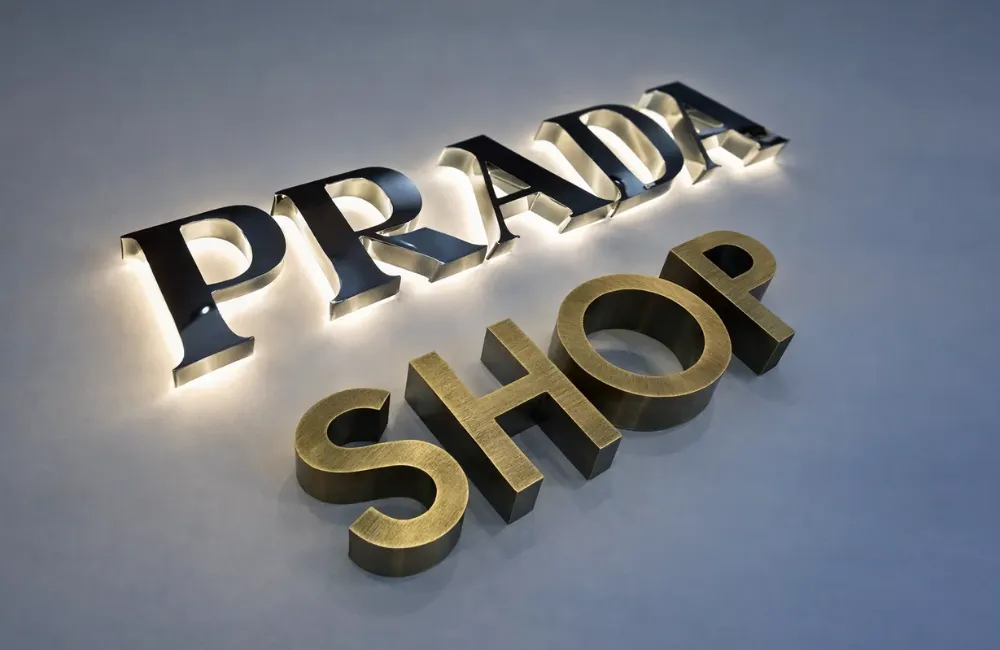
Depth, Shape, and Shadow: The 3D Magic
The reason 3D signage works so well is simple — it feels real.
Raised letters, layered designs, & subtle shadows add a tactile element. People can almost reach out & touch it.
When the sunlight hits just right, shadows move across the letters. That small bit of movement adds life to the design — it feels active, even when nothing’s actually moving.
Some brands even mix 2D & 3D elements to create something unique — a combination of flat design precision & dimensional charm.
Typography: The Voice of Your Brand
Fonts are powerful. They are how your brand talks.
Big, bold fonts tell people you are confident & straightforward. Thin, elegant lettering feels modern & refined. Rounded letters come across as friendly & approachable.
But it is not just about the typeface — spacing and alignment matter too. A well-balanced sign feels calm & intentional, while a cramped one feels rushed & overwhelming.
Your typography should make your message easy to read, even from across the street. That is the difference among being noticed & being ignored.
Also Read-Professional Installation vs DIY: What’s Right for You?
Placement and Scale: Getting It Seen
Even the most beautiful sign can fail if it’s hidden or poorly positioned. Placement & proportion matter more than most people realize.
A sign that’s too high gets missed by pedestrians. Too low, & it loses impact. The key is to place it where people naturally look — eye level for walkways, slightly higher for roads or busy plazas.
And size? Bigger is not always better. A sign should feel balanced with the building or storefront it sits on. It should enhance, not overpower.
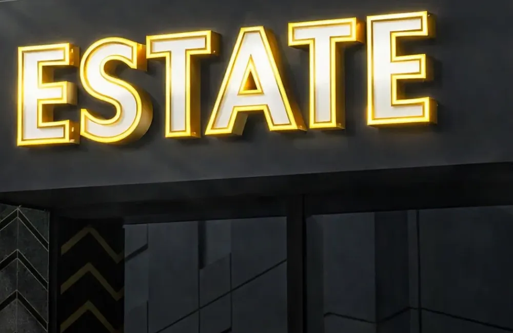
Lighting: Bringing Your Sign to Life
Lighting can completely transform a 3D sign. It adds mood, energy, & character.
- Backlighting gives a soft halo glow — subtle, elegant, & timeless.
- Front lighting is bold and bright, perfect for busy streets.
- Edge lighting adds sophistication, outlining the shape of each letter.
In Abu Dhabi, where evenings are long and streets are alive, lighting isn’t just decoration — it is must. It ensures your brand shines when others fade into the dark.
Staying True to Your Brand
All the design elements — the material, color, lighting, typography — should tie back to one thing: your brand identity.
If your business is modern & tech-driven, your signage should feel sleek and minimal. If your brand is warm and local, go for earthy tones and natural textures.
Consistency builds trust. When people see the same tone in your signage, your interior, your packaging, & your social presence, it feels cohesive — like everything belongs together.
In Closing
A 3D sign does not just show your name. It represents your confidence, your creativity, and your values. It is how you claim your space in a city full of voices.
If you want a sign that tells your story beautifully & lasts for years, Sadaf Designs can help bring that vision to life. Our team understands how to blend creativity, craftsmanship, and branding — so your signage doesn’t just look good; it feels like you.
0 Comment